Discovering unRAID's "Azure" Layout: A Cleaner, More Modern Look
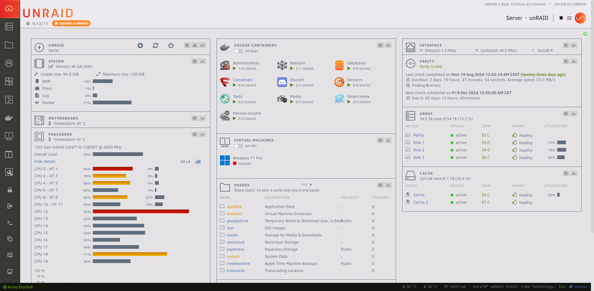
If you've been using unRAID for a while and haven't explored the customization options, you might have missed one of its more modern features: the ability to switch between different layout styles. Recently, I discovered that unRAID offers a few layouts with vertical navigation, which I think significantly improves the overall appearance and usability.
The settings for these layouts are tucked away in the Settings menu under Display Settings within the Dynamix color theme section. By default, unRAID uses the "White" theme, which is fine but a bit dated for my taste. However, after switching to the "Azure" layout, I noticed a cleaner interface with vertical navigation on the left, offering a more modern and organized look. There's also the "Gray" option, which shares a similar layout style. This might be a game-changer if you're still using the default "White" or "Black" themes.
I made this discovery about five weeks into using unRAID, thanks to a post on the unRAID subreddit. I just wish I had found out sooner! Switching to this new layout will take me a few days to adjust, but it’s definitely worth it in the long run for the improved aesthetics and navigation.
Here’s a quick breakdown of how to switch:
- Navigate to Settings.
- Head over to Display Settings.
- In the Dynamix color theme dropdown, select either "Azure" or "Gray."
- Apply your changes.
Below, I’ve added a couple of screenshots showing off the sleek "Azure" layout:
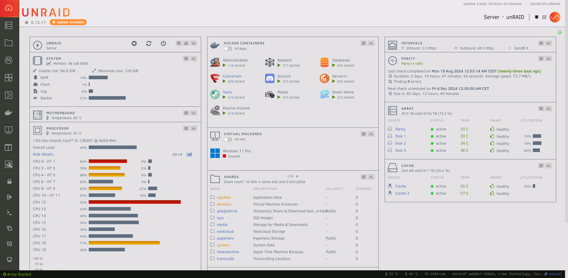
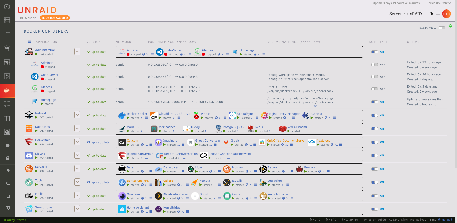
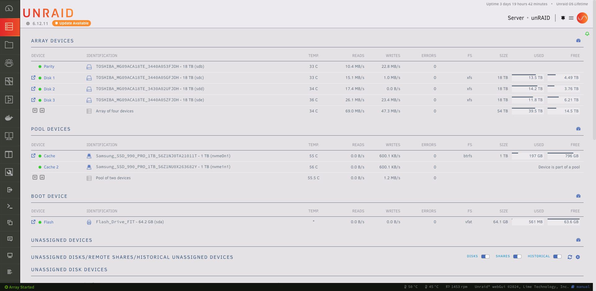
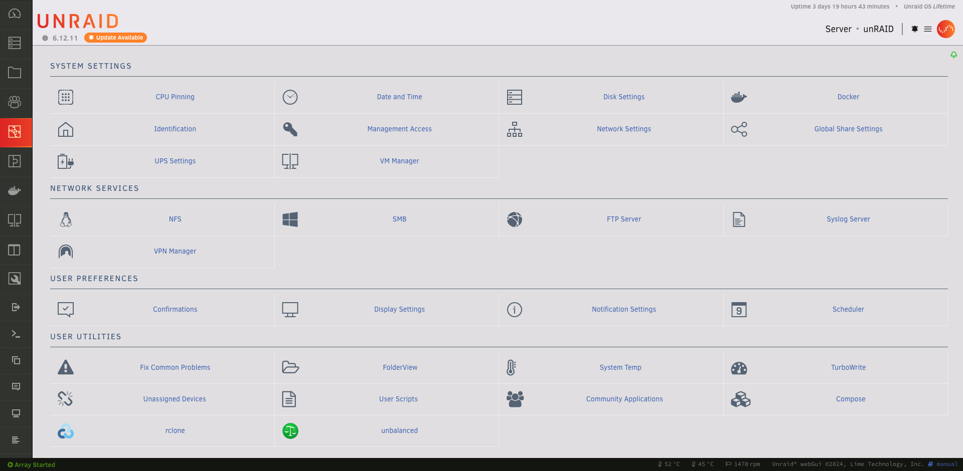
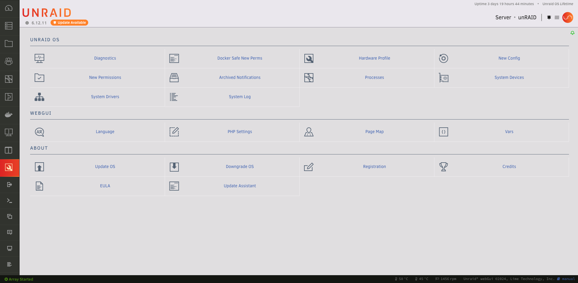
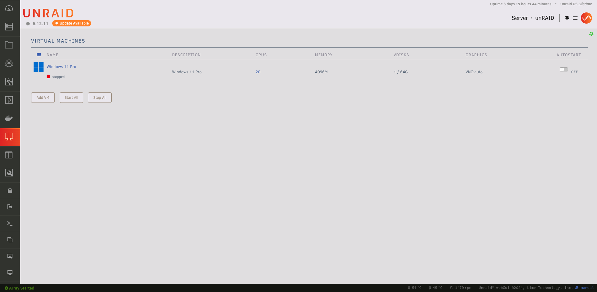
unRAID "Azure" Layout
I highly recommend trying this feature if you haven’t explored it yet. It’s a simple change that can make a big difference in how you interact with unRAID daily. Plus, if you’re like me and appreciate a more polished interface, the "Azure" theme delivers just that.
Happy customizing!
If you’ve found this content helpful and would like to support the blog, consider donating by clicking here. Your support is greatly appreciated!


